- Oracle unveiled a new user experience and brand that features a “warmer” and more global look and feel.
- The new look downplays Oracle’s classic bright-red hues.
- The new design was inspired by Asian, African and Aboriginal art and data, according to lead designers.
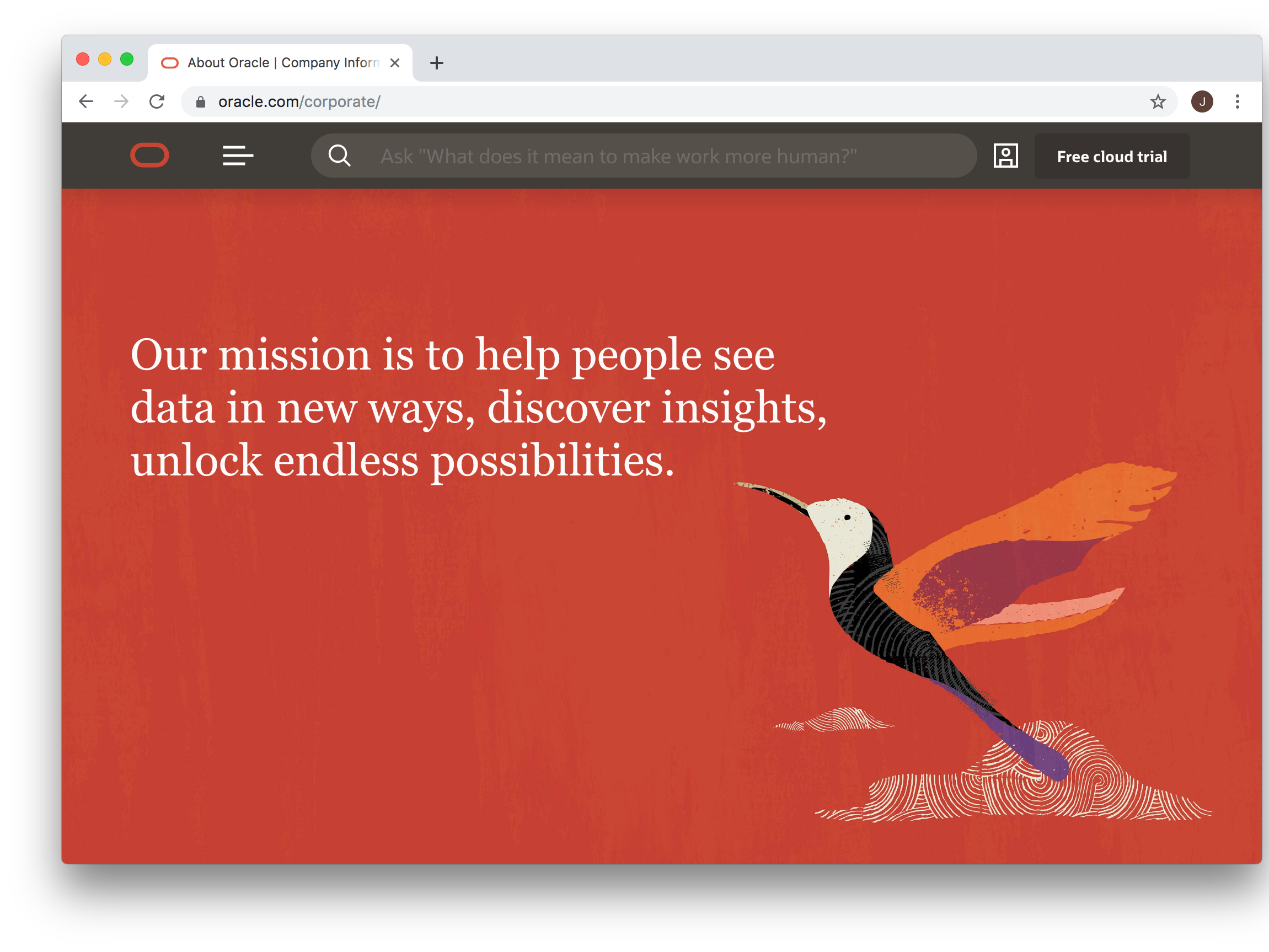
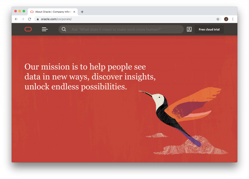
- It also includes a new mission statement written by founder Larry Ellison: “Our mission is to help people see data in new ways, discover insights, unlock endless possibilities.”
- Visit Business Insider’s homepage for more stories.
Oracle this week unveiled a new website design that the database giant’s designers says features a “warmer” and more global look and feel.
The new site was inspired by Asian, African and Aboriginal art, with a nod to Japanese origami art and Oracle founder Larry Ellison’s well-known fascination with that Asian nation’s culture.
The most noticeable change is in the color, said lead designer Jenny Lam.
“The biggest change is the reduction of red,” she told Business Insider – the new design downplays the bright-red hue that’s long defined Oracle’s look.
"Sometimes we don't have to shout all the time," she said. "You see the shift from the bright saturated loud red to one that is warmer, richer."
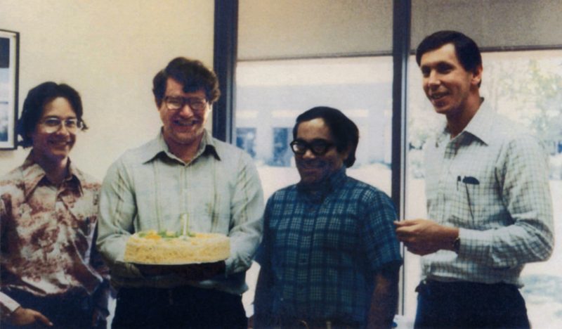
The new site features a photo from the 1970s of Oracle founder Larry Ellison with co-founders Bob Miner and Ed Oates. There's also an image of an orange, purple and black bird on a page with a new mission statement that Ellison himself wrote: "Our mission is to help people see data in new ways, discover insights, unlock endless possibilities."
Ellison was deeply involved in the redesign, as well.
"There are a lot of things that resonated with Larry," Hillel Cooperman, one of the lead designers, told Business Insider. He said one is the use of "unfolding" in navigating the site. "a nod to origami, an art form that Larry was excited about."
The new look and feel for Oracle was unveiled in time for Oracle OpenWorld, the tech giant's annual convention in San Francisco, held this week.
Oracle is a Silicon Valley icon and one of the most dominant enterprise software companies in the world. The new look comes at a time when the company is facing stiff competition in the cloud, where it is up against dominant forces including Amazon, Microsoft and Google.
Here are some images from our look at the new Oracle design.
For many years, Oracle has been closely-associated with a particularly bright shade of red.

When you go to Oracle's corporate page now, though, it features an image of a bird with a new Oracle mission statement written by founder Larry Ellison. And you may notice that the red is less aggressive.
A historical timeline includes a photo from the 1970s showing Larry Ellison with Oracle's cofounders at their first office in Santa Clara, California.
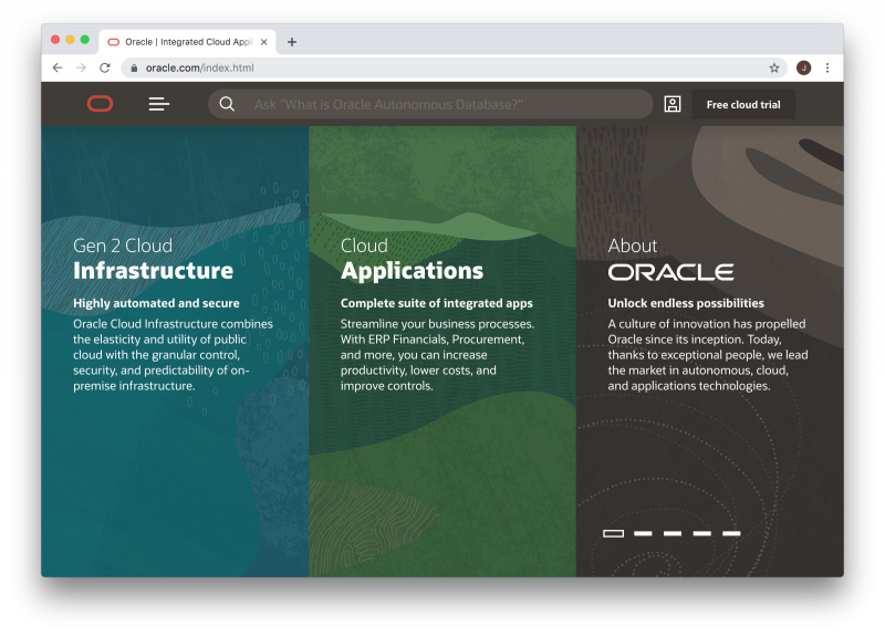
The new homepage highlights the areas where Oracle is focused on: cloud infrastructure and software.
Here's an example of an analytics application, featuring the new branding.

Here's an example of a customer sales organization application.

Here's a sample expense reporting application.

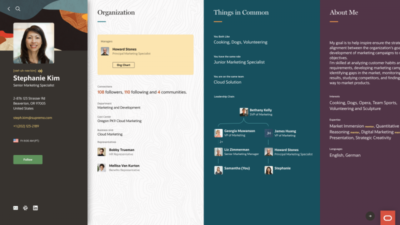
A new HR application features origami-style unfolding to reveal different types of information.
Here's a sample healthcare supply chain application.

Here's a sample public sector client applications.
