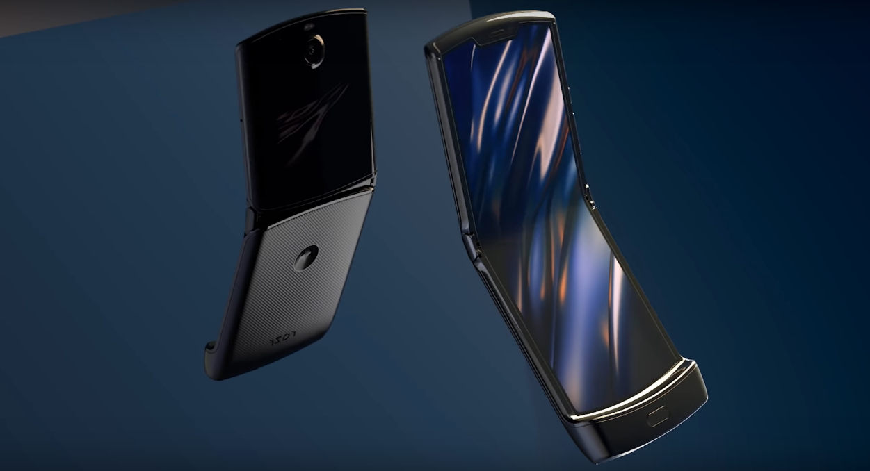
- Motorola just announced a new version of its iconic Razr flip phone from the early 2000s.
- The new Razr has a foldable screen, but maintains a design that’s very similar to the original.
- Based on what we know about the new Razr, it seems like it could offer some benefits over rival foldable phones, like the Samsung Galaxy Fold and Huawei Mate X.
- Its flip-phone-inspired design feels more natural to use, and the crease where the screen folds doesn’t seem as noticeable, for example.
- Visit Business Insider’s homepage for more stories.
It’s 2019, and the flip phone is making a comeback.
Motorola is reviving its iconic Razr flip phone from the early 2000s with a very modern day twist. Yes, it’s still a flip phone like you probably remember. But the new version trades out the original Razr’s sleek keypad and tiny screen for a high-resolution touch screen that stretches across the entire device and folds in half.
It’s available for preorder on December 26 through Verizon for $1,500, and is launching in January.
Motorola is the latest smartphone maker to announce a foldable smartphone, following the likes of Samsung and Huawei. However, Motorola’s approach to the foldable phone is entirely different than its rivals. Samsung and Huawei are using foldable display technology to expand the size of the phone’s screen so that it can function as a tablet when opened and a phone when closed.
But Motorola is instead implementing a more vintage design that brings us back to the flip phone era. It's not trying to give you two devices in one - rather, it's trying to make your smartphone more compact at a time when users crave increasingly larger screens.
The Razr has a 6.2-inch screen, which is around the same size as the iPhone 11's display, and a small 2.7-inch screen on the front for viewing notifications. There's a fingerprint sensor embedded in the thicker portion of the phone near the bottom, and a 16-megapixel main camera. You'll get 128 GB of storage space, and the phone is powered by Qualcomm's Snapdragon 710 processor and includes 6 GB of RAM.
But none of those features are necessarily what sets Motorola's new Razr apart from other smartphones, including its other foldable rivals. Here's a look at the Razr's standout features.
The Razr's hinge looks like it could feel more natural than that of other foldable phones.
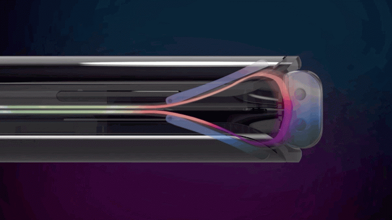
The hinge on the Motorola Razr is placed squarely in the middle of the phone's screen, enabling it to open up and snap shut like a traditional flip phone.
It's a revival of a form factor that most people are already familiar with, which I imagine would make it much more natural to use. With the Razr, Motorola isn't asking that you get used to a new form factor like Huawei and - rather, it's creating a sense of familiarity.
The hinge also allows both sides of the phone to fold completely flush, and Motorola says it experimented with four versions of the hinge before landing on this one.
And based on how the phone looks, it seems like the crease where the screen folds in half won't be very apparent on the Razr. That may be one area in which the Razr holds an advantage over Samsung's Galaxy Fold, which I felt had a noticeable crease running down its screen.
Motorola is fully embracing the Razr's nostalgic appeal with a hidden "Retro Razr" mode.
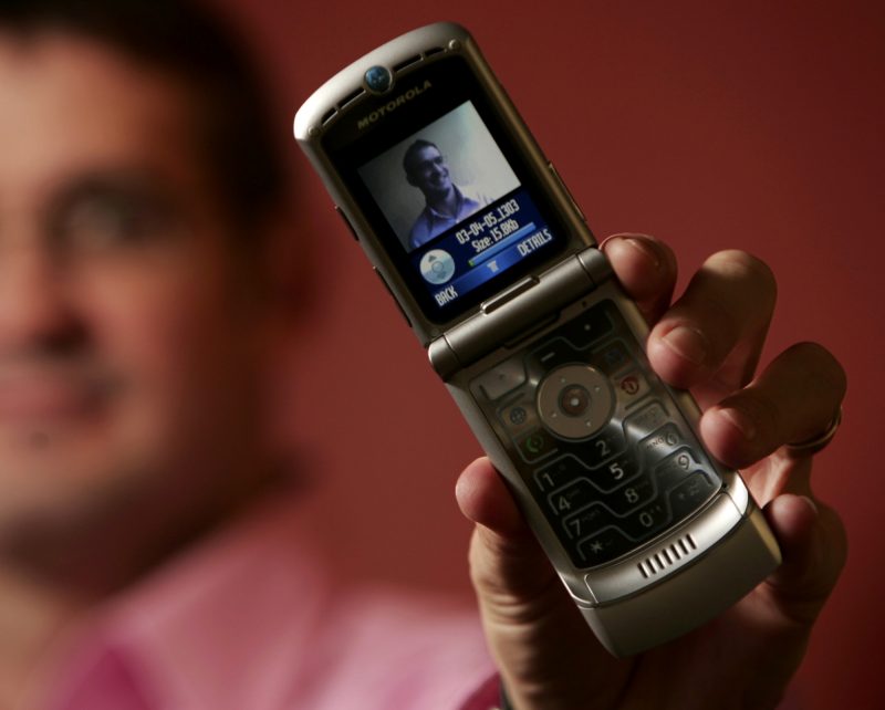
If you really want to feel like you're back in 2005, turn on the Razr's secret "Retro Razr" mode. This mode brings back the look and feel of the old-school Razr's software, replacing the traditional Android user interface with a skin that imitates the Razr's dialer, according to The Verge and CNET, which tried out the feature.
The phone's 6.2-inch screen takes on the appearance of a keypad and vintage flip phone screen, and you'll even need to use the navigation buttons on the keypad portion of the screen to navigate it. But this throwback mode isn't immediately apparent; the option only becomes visible after you edit the Quick Settings menu, which is accessible by swiping down from the top of the screen, and add the "Retro Razr" button.
You can actually snap it closed to hang up.
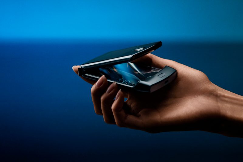
The satisfaction that comes with snapping your phone shut to end a conversation has been completely lost in the smartphone age. Motorola is hoping to bring that back with the Razr, which has an optional feature that lets you hang up by closing the phone's lid. You can also turn this feature off to continue the conversation when the device is closed.
That being said, a couple of journalists who went hands-on with the device have said it's not that easy to close the phone with one hand.
The Razr's front screen lets you see the basics without opening your phone.
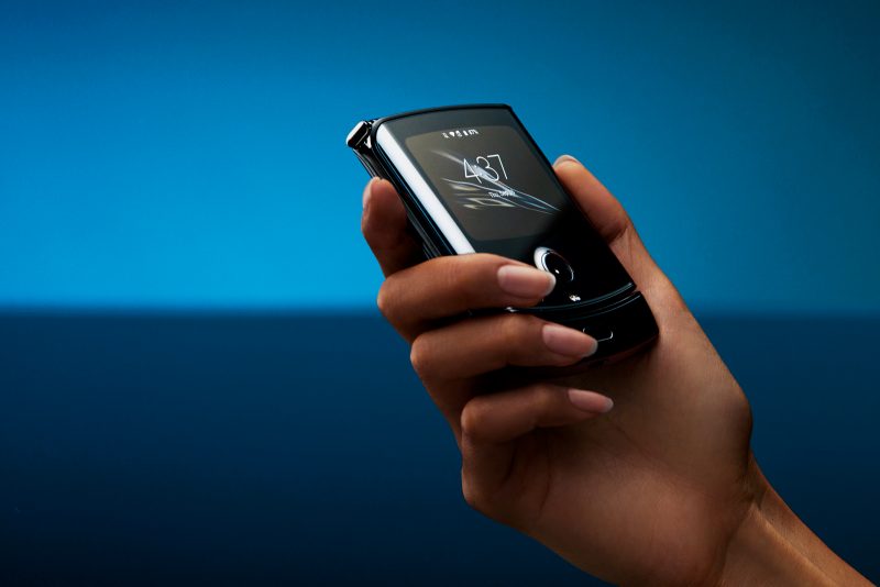
The Razr's front screen, which Motorola calls the Quick View display, essentially serves as the lock screen. It can display information like the time, notifications, and media playback controls, and you can use it to activate the Google Assistant and authorize mobile payments. It's not necessarily a rare find on smartphones, but the fact that you can check out this glanceable information while the phone is in a more compact form will surely add some convenience.
The Razr's simplicity is also sure to be one of its best qualities.
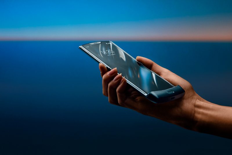
The Motorola Razr's nostalgic design certainly gives the phone a more simplistic feel. But it's that combined with the software that makes me believe the new Razr could be an ideal choice for those who value a basic and straightforward experience.
Motorola says the new Razr won't come with any duplicate or unnecessary apps, which has been a common criticism of rival smartphone makers like Samsung and LG. Those companies, however, have made improvements on that front in recent years.
But beyond that, the Razr was designed to be just a phone and not much more. It's not trying to be two devices in one - its selling point isn't that it can run more apps on screen at once than any other phone. It's simply just a phone, and that's probably part of what makes Motorola's (albeit still expensive) foldable phone cheaper than Samsung's nearly $2,000 Galaxy Fold.
But that simplicity could also be one of its biggest drawbacks.
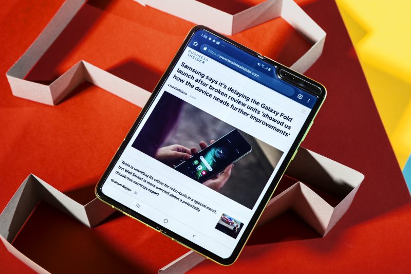
Yes, there's a very strong argument for why Motorola's Razr is the most sensible and practical foldable phone designs we've seen yet. It's easy to see the value in the convenience that comes from having a phone that's more portable but also offers a screen that's just as large as that of the average smartphone.
But at the same time, you could also argue the opposite, that for $1,500 Motorola isn't adding anything new to the experience beyond convenience and nostalgia. With the Galaxy Fold, as flawed as it was, there was a glimpse of promise in it.
The Galaxy Fold's questionable durability and high price made it impossible to recommend when I tried it back in April. But even after just spending a few days with it, I saw the value in having a device that unfolds like a book to offer a larger screen: It meant I didn't have to carry a a tablet with me during my commute to read a book or watch Netflix on a larger screen. It's an expensive benefit, but one that made me excited about a future in which devices like the Fold weren't quite as pricey.
I don't know if the Razr will have that same effect, but I'm looking forward to finding out for myself.

