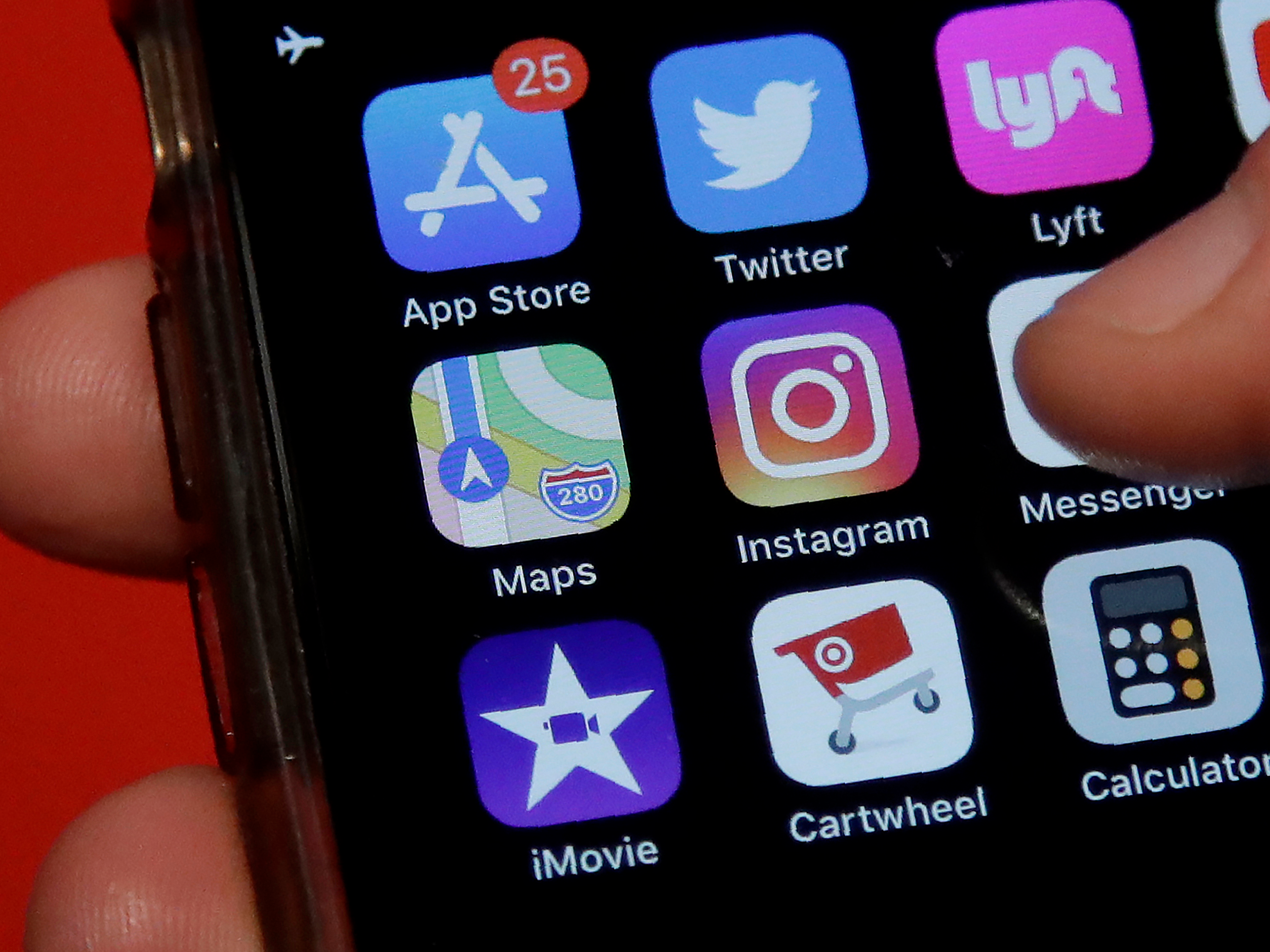
- Instagram launched as an iOS app in 2010, and became available for Android users in 2012.
- Instagram of 10 years ago looked different from the app we use today, and was missing many features that now seem vital.
- The original app didn’t have messages or stories, and photos had to be cropped to square images.
- Visit Business Insider’s homepage for more stories.
When Instagram launched in 2010, using it was a much different experience than the Instagram of today.
Instagram started as a photo-sharing app, but it didn’t have the additional features it boasts today, including Instagram live, stories, messaging, and more. The company has made other changes in the past decade, like changing the algorithm the determines what photos you see rather than showing them in chronological order.
This year, Instagram has experimented with removing some early features. It nixed the following tab in October, which had existed as far back as 2011 as a tool for keeping an eye on what posts your friends interact with. Even more drastically, Instagram is now testing out removing likes worldwide, an experiment that started out this summer in several countries, including Canada and Australia, and spread to the US a few weeks ago.
But 2010 was a simpler time – it was two years before Facebook bought the app for $1 billion. In other words, Instagram was just getting started. Here’s how it looked a decade ago compared to today.
For starters, the Instagram logo looked pretty different.

The Instagram logo of 2010 was more neutral-toned and looked more like a camera. And the Instagram typeface at the top of the app was slightly different than it is today.
The 2019 version of the logo still has a minimalist camera, but now in eye-catching colors.

Adweek called the new logo a "travesty," and The New York Times called the whole event the "great Instagram logo freakout of 2016."
The bare bones of Instagram's design have stayed the same.

Back in 2010, all photos uploaded to Instagram had to have a square crop. Otherwise, the layout is still basically the same as it has always been - you scroll through a stream of photos, which have the poster's name and photo on the top left, and comments below.
When the app launched in 2010, the tabs were titled: Feed, Popular, Share, News, and, at the far right, your own profile.
The tabs have changed, and now stories live at the top of the screen.

Tabs to access different section of the app have stayed on the bottom, although the exact purposes and names have changed. The tabs don't display names anymore, but their purposes are: home, search/explore, share, and activity. The far right tab still takes you to your own profile.
Instagram added, then removed, the "Following" activity tab, which was where the heart is now. This tab now shows likes, comments, and followers on your account.
Today, the "Explore" page — which you can access by clicking on the spyglass symbol — takes the place of what was once the "Popular" page.

This section shows different posts to everyone based on other posts you've interacted with - for example, I clearly follow a lot of animal accounts.
There were also far fewer photo-editing tools in the 2011 version of Instagram.

Typically, early Instagram users would pick a filter from a carousel of options and that was it.
The latest version of Instagram has 13 editing tools and 23 filters. You can also determine how strongly you want the filter to apply, an upgrade from the days when most people slapped on a "Valencia" filter and called it a day.


