- Facebook announced a new logo on Monday.
- The new logo – which reads FACEBOOK in all-caps – will be used for a “company brand” that encompasses products within Facebook’s portfolio, like WhatsApp and Instagram.
- The all-caps branding seems like a direct affront to millennials and Gen-Zers. Lowercase letters aren’t just “chiller” – they’re easier to recognize.
- Put plainly, all-caps is harder to read, and to anyone who uses the Internet regularly, it looks like shouting.
- The logo also constantly announces the presence of Facebook, the center of a wide variety of societal stresses, across its products.
- Visit Business Insider’s homepage for more stories.
On Monday, Facebook announced it would be rebranding its corporate logo. The new brand is an all-caps FACEBOOK.
The new logo, however, could be off-putting to the millennials and Gen Zers who are addicted to the social media giant’s products. Put plainly, all-caps is harder to read, and to anyone who uses the Internet regularly, it looks like shouting.
To see how jarring all-caps can be, CONSIDER THAT TEXT LIKE THIS DOES NOT FEEL LIKE A WELL-RESEARCHED ARTICLE, BUT INSTEAD JUST SCREAMING.
FACEBOOK is, according to a Facebook newsroom release, a new “company brand” that will encompass all of Facebook’s products – it’s separate from the Facebook app, which will retain its own branding.
The new logo is an affront to millennial and Gen-Z sensibilities. All-caps is often read as shouting or aggressive — the last thing I need is Facebook shouting at me.

Modern society has put us millennials and Gen-Zers through enough. Between climate change, unaffordable healthcare, debt, and the inability to date, it's no wonder we're more stressed than ever.
An all-caps logo blasted across my screen will not only make my head hurt, but may even add to that stress - text in all-caps is more difficult to read than normally capitalized text.
"At standard body text sizes, capital letters - or simply caps - are harder to read than normal lowercase text," Matthew Butterick of Practical Typography writes.
Even the US Navy switched away from all-caps in 2013, CNN reported. They found lowercase more readable. And there have been calls to do away with the capslock option completely.
Text in all-caps also carries a connotation of the author shouting at the reader. "All-caps in an email looks like shouting because when someone is shouting, you're aware of the shout, and not the nuance," Paul Luna, a professor of typography and graphic communications, told the New Republic in 2014.
While awareness of the shout and not the nuance could be a good description of Facebook, the new all-caps logo could further alienate younger users.
As Edith Zimmerman notes in The Cut, lowercase typing feels more "fresh and youthful." It conveys a breeziness and chillness that a generation of VSCO girls embraces. Everything is on fire, so we may as well be cool.
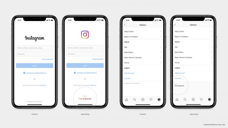
While you don't necessarily have to write FACEBOOK every time you refer to Facebook's portfolio — which includes services like WhatsApp and Instagram — the all-caps logo will appear on any app that comes from Facebook.

The core Facebook app and the company's name will continue to be written as before, but the new all-caps logo will appear prominently on the other services provided by the social media giant, according to Facebook's announcement of the branding shift.
So when you log into networks like Instagram or WhatsApp, you will see FACEBOOK screamed at you (albeit colorfully) at the bottom of your screen.
In the announcement, Facebook says the new logo was "designed for clarity." But typographers say that lowercase is the way to go when it comes to clarity.
Butterick writes that lowercase letters "create a varied visual contour that helps our brain recognize words."
"ALL-CAPS FILL THE SPACE, so there's an element of feeling that the message is crowding out everything else," Luna told the New Republic.

For a company that's often mired in controversy, you'd think that Facebook wouldn't want to crowd out the content of popular apps with its ALL-CAPS LOGO.
With female Gen-Zers already reaching tech fatigue - both skeptical of and inextricably tied to the technology they've grown up with - it doesn't seem all too wise to "crowd out" everything else with that logo.
We turn to apps like Instagram to scroll away our existential fears. Sure, maybe it's mining my data, but at least I'm seeing fun astrology memes.
But it seems like a cruel joke to see FACEBOOK blazing at the bottom of my screen whenever I go to my login screen or change my settings.
Perhaps it's the ultimate millennial/Gen-Z metaphor: The wider issue - Facebook, with all its controversies and pitfalls - is always lurking underneath, even when you just wanted to go follow your friend's dog. Now, even the things the Internet positions as escapist are emblazoned with a logo that reminds you of who, exactly, your scrolling is beholden to.
Here's to hoping that Gen-Zers "Ok boomer" the new logo. Or just maybe, we'll finally be able to log off for good.
