- Sometimes, companies rebrand when they feel like they need a refresh.
- Often, these rebrands are successful.
- Other times, fans get heated about the changes, like when Dunkin’ Donuts dropped the “Donuts” from its name, and Weight Watchers decided to become WW.
- Visit INSIDER’s homepage for more stories.
When done right, a company rebrand can inspire new fans and increase sales. However, with change often comes backlash.
Fans freaked out over Dunkin’ Donuts’ decision to drop the “Donuts” from its name, and complained when Weight Watchers changed its name to simply WW.
Only time will tell if these rebrands were a success, or whether the companies would have been better off doing nothing. Keep scrolling to see some of the most controversial rebrands by major companies.
Sears adopted a new slogan and logo.
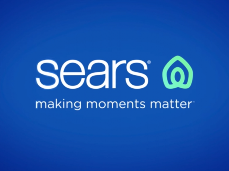
In April 2019, Sears rolled out a new slogan, “making moments matter,” and a new logo. The announcement came in a Facebook video captioned, “Making moments matter. The big, the little, and all of them in between. We’re here for yours.”
People were quick to point out, however, that the symbol in the new logo was not only confusing, it also heavily resembled Airbnb's logo. Sears responded in the thread of its Facebook post saying the following:
"The new icon was created to represent both home and heart. This shape also conveys motion through an infinity loop, reminiscent of one getting their arms around both home and life. The rings, like those of a tree trunk, show longevity."
Weight Watchers changed its name to WW.

Weight Watchers has been around since 1963, and is one of the most famous weight loss programs in the country. It has even been backed by Oprah, who is a member of the company's board and owns a stake in it.
In September, Weight Watchers rebranded itself as WW in an effort to focus on overall health as opposed to just weight loss. While some people liked the changes that came with the rebrand, such as the WellnessWins reward system, critics felt that the change did not go far enough to pivot the brand from weight-loss to wellness.
Dunkin Donuts is now just Dunkin'.

Dunkin' Donuts has been a beloved doughnut institution since 1950, but people freaked out about its recent rebrand.
In September, it announced that it would change its name from Dunkin' Donuts to just name to Dunkin'. Many didn't know what to think.
Some were outraged, while others thought it was stupid. However, the main consensus seems to be that it was just unnecessary.
It has led to some hilarious Twitter reactions, though.
Toys 'R' Us is now Geoffrey's Toy Box.
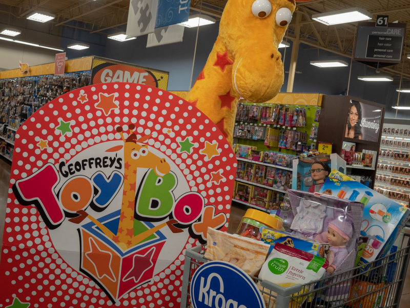
Toys 'R' Us, once the the premiere destination for toys, went bankrupt in 2017, and announced it was closing all of its stores in January of this year.
In October, however, the company announced that Geoffrey the Giraffe had been "traveling the globe," and would be rebranding as Geoffrey's Toy Box, placing pop-ups in Kroger grocery stores this holiday season.
The reworked brand is a venture by former lenders of Toys 'R' Us, who still own the toy seller's intellectual property and brand names.
Employees who were laid off were not happy about the messaging, which likened Toys 'R' Us' bankruptcy to a vacation.
Uber changed its logo to just the name of the company.
The popular ride-hailing app Uber experienced a lot of controversy in the last couple years, and decided it was time for a change. The brand redesigned its logo to be the company name, rather than circular motif logo it was previously.
Some critics questioned the redesign, noting the company did a similar overhaul less than three years ago. The logo was met with criticism then, too.
Celine dropped the accent from its name.
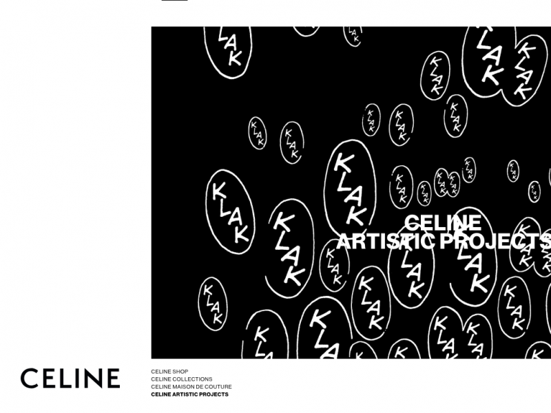
The French luxury goods brand Celine has been producing high-end clothes and accessories since 1945. Their recent decision to remove the accent from their name (formerly Céline) has been wildly unpopular among its fans.
The decision was made when new creative director Hedi Slimane took over, and were seen as a nod to Celine's '60s collections, which didn't use the accent. However, the internet remains very divided over the move. Per Who What Wear,some fans felt "shocked, angry, and betrayed."
The Library of Congress has a new logo.

The Library of Congress - the largest library in the world, and the oldest federal cultural institution in the U.S. - changed its logo for the first time in eight years this year, and a lot of people were not thrilled, per Fast Co.
While the designer has said that the dynamic design reflects the Library's wide range of content, the opposition think it's cheap-looking, likening it to a "Waffle House level aesthetic." Most people, however, are just sad to see the old logo go.
IHOP announced that it was rebranding as IHOb, the International House of Burgers.

Less of a rebrand and more of a "marketing troll," IHOP announced in June that it was renaming itself IHOb, the International House of Burgers.
The marketing stunt was meant to introduce a new line of hamburgers, and did this successfully. However, despite the rebrand being only temporary, people hated the idea of the new name, and made fun of its branding and typography choices.
Gap tried a new logo redesign, but scrapped it amid backlash.

In 2010, beloved clothing company the Gap attempted a redesign of its classic logo. Whereas originally the logo featured a navy blue box with white lettering, the new logo showed black lettering on a white background with a small navy box floating in the top right corner. Fans of the brand were not impressed.
More than 2,000 comments criticizing the new logo appeared on the company's Facebook page, reported The Guardian, and a Twitter account set up to protest the change garnered 5,000 followers. In response, the brand decided to go back to its original logo.
"There may be a time to evolve our logo," said then-president of the Gap brand in North America Marka Hansen on the company's Facebook, "but if and when that time comes, we'll handle it in a different way."
Starbucks dropped the "Starbucks Coffee" from its logo.
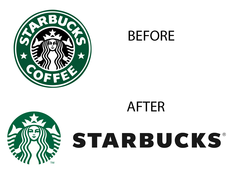
In 2011, Starbucks, which was founded in 1971 and has had the same logo since 1992, decided it was time for a change. Its new logo would drop the words "Starbucks Coffee" and feature a more stripped-down version of its iconic siren.
The change was meant to mark a new chapter in the company's history, but within hours, per CNN Money, the backlash started to pour in both on social media and on the company's own website. Commenters said both that they preferred the old logo and that they didn't understand the change from a business perspective.
Unlike the Gap, Starbucks did not cave, and its new logo remains the same to this day.
