- By most major indicators, the US economy is doing pretty well right now.
- But many Americans feel left out of the apparent boom.
- We put together 10 charts that help illustrate that divergence.
- Visit Business Insider’s homepage for more stories.
Although there are some clouds on the horizon hinting at a possible recession, most of the major US economic indicators are pretty strong right now.
Economic growth is steady, the unemployment rate is extremely low, and the stock market has massively rebounded since the last financial crisis.
Read more: Here’s why the economy feels so bad when it sounds so good
But despite that, many Americans feel left out of the apparent boom. Rising costs and debt, stagnant wages, and high and rising inequality create a sense of a two-track economy, where the winners get richer and everyone else has to run faster just to stay where they are.
Here are 10 charts that break down why people are struggling, even when the economy appears so strong.
Many of the top-line metrics used to judge how the US economy is doing look pretty good right now. Gross domestic product, a broad measure of overall economic activity, has been growing steadily for years, although recent revisions suggest that growth was not as robust as originally believed.
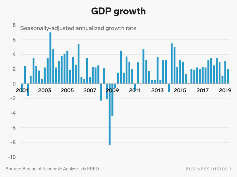
The revisions suggested that growth in 2018 was closer to 2.5% rather than the initially touted 3%, as reported by The New York Times.
The unemployment rate has been steadily dropping since the end of the Great Recession. It is now lower than it has been in decades.

At its peak in October 2010, unemployment in the US topped out at 10.0%. As of July 2019, that number has decreased and now stands at 3.7%.
In the last several years, the economy has steadily added around 200,000 jobs per month.

The monthly change in non-farm payroll employment is one of the most widely watched economic figures in the US. Since January 2012, the US has been steadily adding jobs each month at an average rate of about 203,000 per month.
A few years before the start of the above chart, however, things were much more dire. In the depths of the Great Recession in 2008 and 2009, the economy was losing hundreds of thousands of jobs each month as businesses ground to a halt in the wake of the 2008 financial crisis.
In March 2009 alone, employment in the US fell by 803,000 jobs.
Other measures of labor market health, however, have been improving in recent years — but they suggest a somewhat less rosy picture.

The prime-age labor force participation rate measures the share of adults aged 25 to 54 who are either working or actively looking for work.
It shows how many people are either employed or fit the Bureau of Labor Statistics' official definition of unemployment, and so a drop in this rate indicates an increase in the number of people who aren't working and have stopped trying to find a job.
While this measure is up from its deepest post-recession lows, it remains below where it was for most of the 2000s, suggesting that many adults in their prime working years remain sidelined from the workforce.
But many Americans haven't seen the advantages of a growing economy.
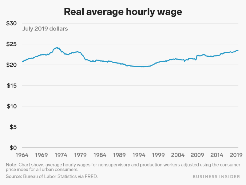
As shown in the chart above, when adjusted for inflation to 2019 dollars, real average wages have been mostly stagnant for decades.
Another big factor in why the economy might not feel as good as it looks is the rising cost of entering and staying in the middle class.
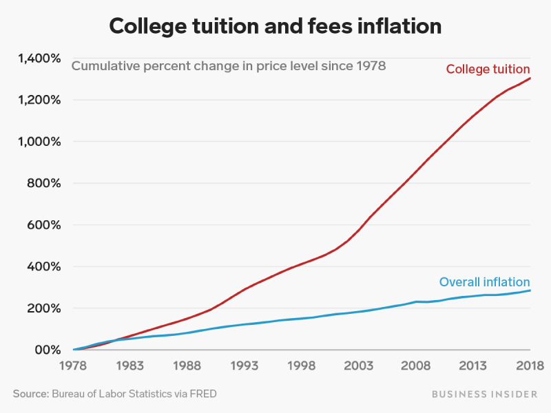
College tuition has risen at a much higher rate than overall inflation for decades.
Several factors have contributed to the massive increase in college costs, and the situation is set to only get worse.
One of the consequences of that rise in college tuition is a massive increase in student debt.

Americans now collectively owe nearly $1.5 trillion in student loans, more than six times the outstanding debt load at the start of 2003.
The student debt crisis has gotten bad enough that many borrowers still owe money into their sixties, and many younger adults have put off major life milestones like having children because of their debt load.
Read more: 10 mind-blowing facts that show just how dire the student-loan crisis in America is
Other costs have skyrocketed in recent years as well. Inflation for medical care since the turn of the century has been much higher than overall inflation.
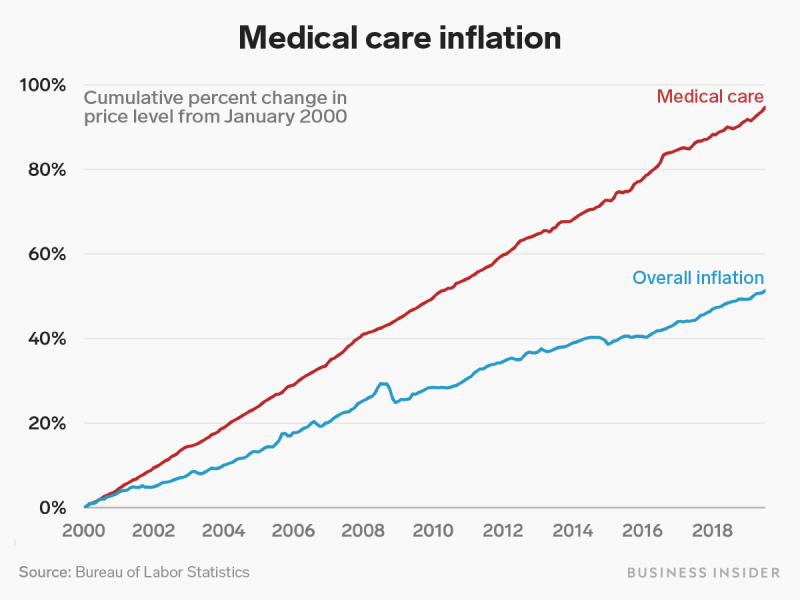
Health care and its costs remain among the biggest hot-button issues in US politics. Most of the democratic candidates for president have released proposals for healthcare reform, ranging from tweaks to Obamacare like adding a public insurance option, as suggested by former Vice President Joe Biden, to a full-blown overhaul of the health care system, going to a single-payer "Medicare for All" plan, as championed by Sen. Bernie Sanders and Sen. Elizabeth Warren.
Another factor contributing to why the economy doesn't feel as good as it could is rising income inequality.
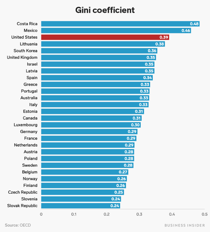
In 2016, the US scored much higher on a standard measure of inequality than most other wealthy, developed economies.
The Gini coefficient shows how far away from equal a country's income distribution is. A coefficient of 0 indicates a completely equal distribution, where everyone has exactly the same income, while a coefficient of 1 indicates a completely unequal distribution, where one person receives all of the income in a country and everyone else gets nothing.
Higher inequality in the US suggests that many Americans are being left out of the current boom, while those at the top keep seeing their wealth increase.
Inequality has also gotten worse in the US in the last several decades.
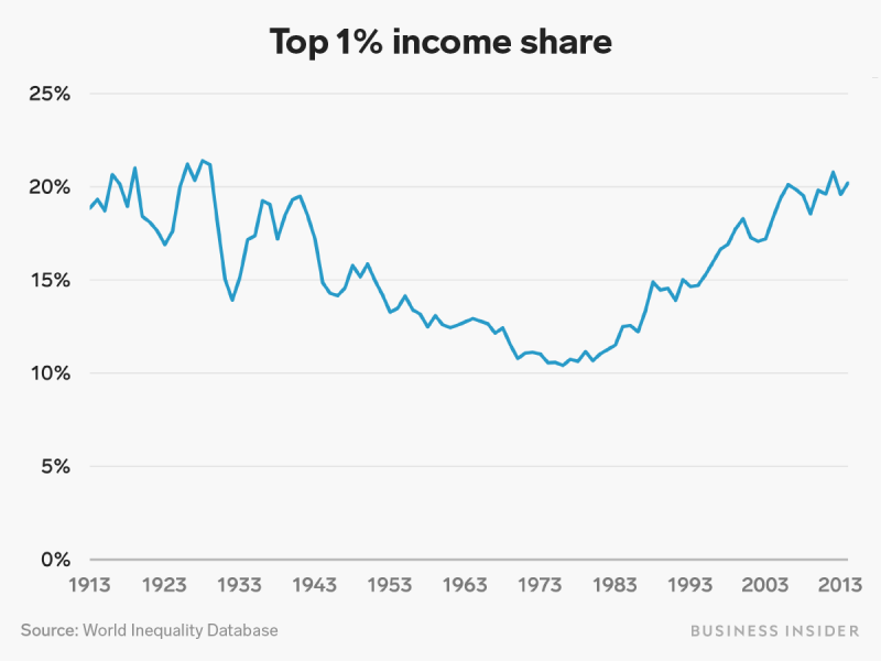
After World War II, the share of national income going to the top 1% steadily declined. It has climbed dramatically since the 1980s, returning to Gilded Age levels.

