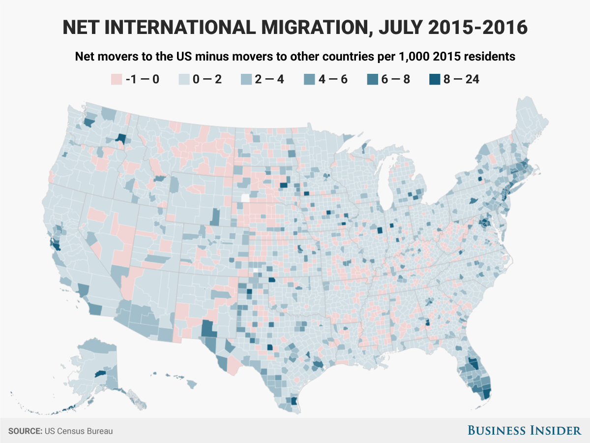
The US Census Bureau recently released estimates of how the population changed in each of America’s 3,142 counties and county-equivalents between July 1, 2015 and July 1, 2016. Among those estimates are the major components of population change, including net international migration, or the number of people who moved to a county from another country, minus those who leave the county for another country.
International migration was only a small part of population change in most of the nation’s counties. About two-thirds of counties saw less than a 0.1% change in their populations between 2015 and 2016 because of immigration and emigration.
Here’s a map showing which counties had the most net international migration relative to their 2015 populations.
And here are the ten counties with populations over 5,000 that had the highest rates of net international migration:


