- Volkswagen recently unveiled the newest iteration of its logo, giving it an updated, much flatter look than its old logo.
- Many other automakers have changed their logos throughout the years, including many of today’s top brands.
- Many other logos are gone forever, either from the brand going out of business or the brand being retired by the parent company.
- Here’s a list of some of the most significant.
- Visit BusinessInsider.com for more stories.
Volkswagen unveiled its new flat-look logo on September 19 at the Frankfurt Auto Show after a 19-year run with its previous insignia.
Some automakers choose to redesign their logos often. For example, Cadillac has had over 30 new redesigns of their wreath and crest emblem. Only recently have they decided to drop the wreath design in favor of a clean shield-style emblem.
Read more: The 14 coolest features in the Porsche Taycan, the company’s new $150,000 electric Tesla rival
However, automakers like Ford have stayed consistent with their insignia appearance. The automaker has only changed its logo three times since formally adopting its recognizable blue oval in 1927, according to Autowise.
Still many other logos have been retired, never to be seen again, after the brand went out of business or was retired by the parent company.
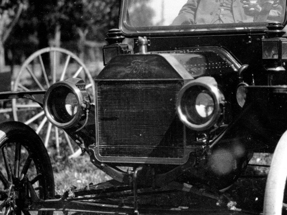
Before the iconic oval, Ford had a script lettering emblem, pictured below, and a one with an art nouveau-esque border prior.
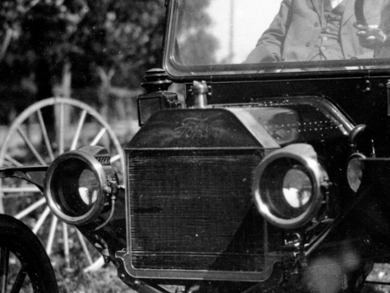
Source: New York Times
Ford has had the iconic blue oval logo since 1927 and has seen three changes to its color and shape since, according to Autowise.
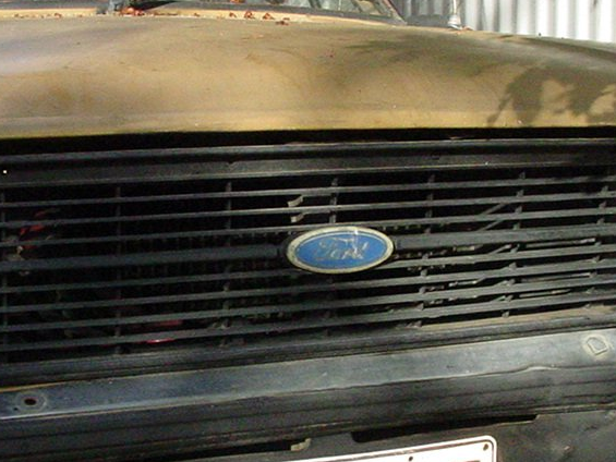
It was refreshed in 2003 to look more rounded and shaded, according to The New York Times.
The Chevrolet bowtie logo was introduced in 1913, according to General Motors.
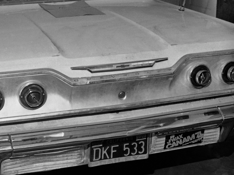
Source: General Motors
The emblem first appeared on the Chevrolet H-2 Royal Mail, pictured below, and H-4 Baby Grand models, according to the automaker.
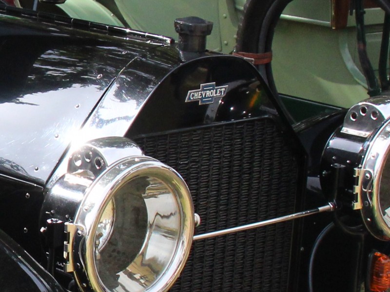
Source: Chevrolet
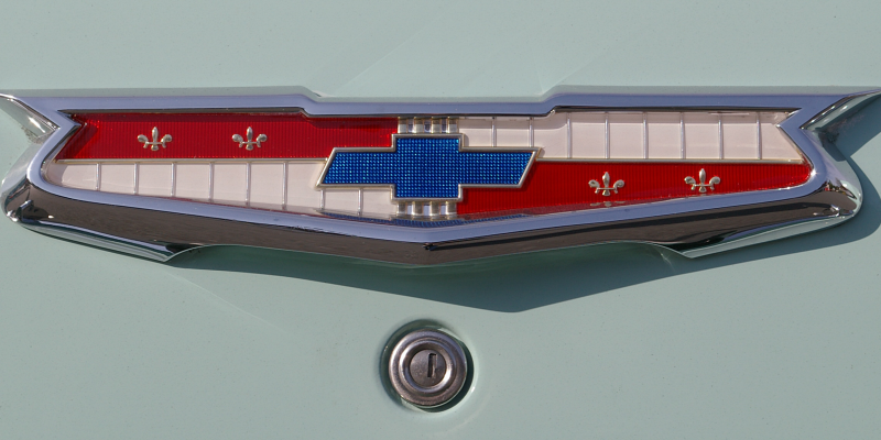
It's also seen color variations throughout the year, as can be seen on this 1955 Bel Air...
...and this 1968 Impala.
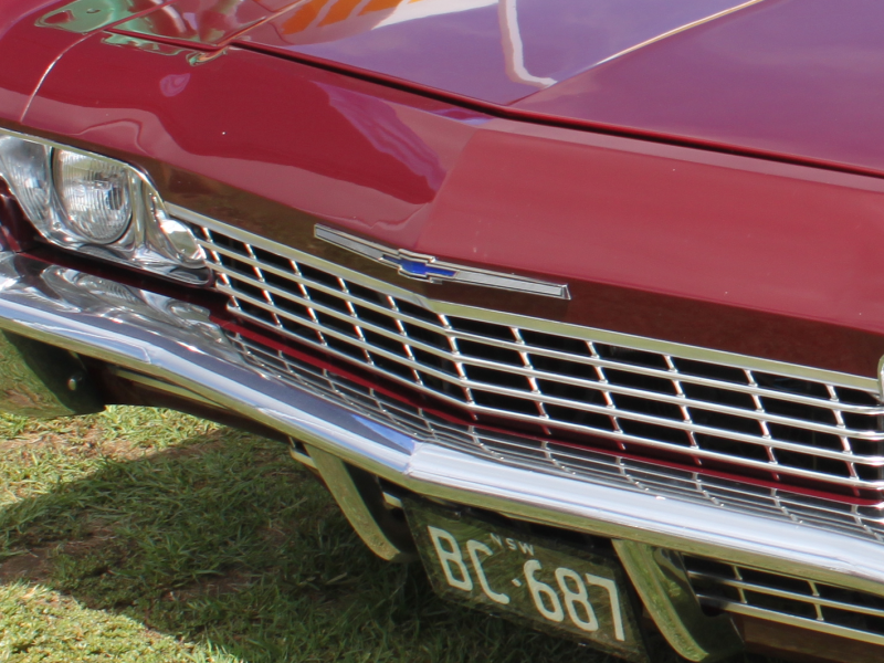
Chevrolet has gone through nine different versions of the bowtie before settling on the current one in 2013.
Cadillac's wreath and crest emblem has been redesigned more than 30 times over the past century, according to Hemmings Daily.
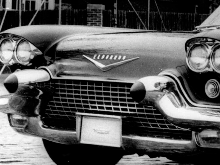
Source: Hemmings Daily
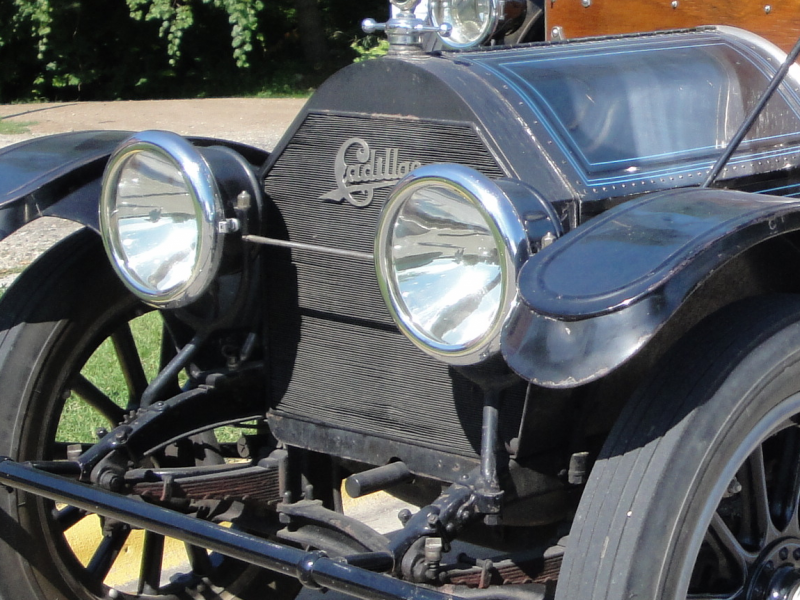
This 1912 Cadillac Model 30 had its logo in script instead of a crest and wreath.
The current iteration of the automaker's wreath-less emblem came in 2014. The iteration before, with a wreath, is pictured below.
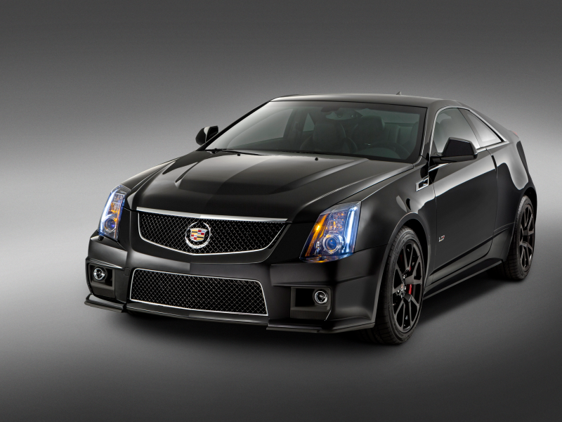
"This new Crest matches the lower, longer, leaner mantra of our current car designs," Cadillac Executive Design Director Andrew Smith said in a prepared statement.
A single-shield Buick logo, pictured below, first appeared in 1937, according to General Motors.
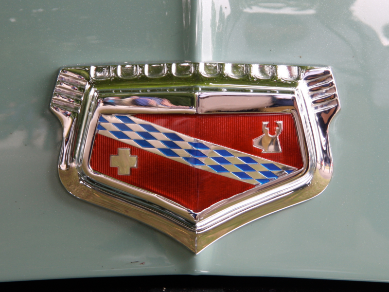
Source: General Motors
The 1975 Buick Electra, pictured below, had the crest enclosed in a metal circle.
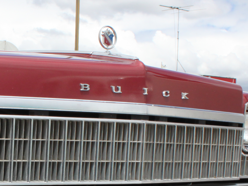
The recognizable tri-shield Buick logo was not introduced until about 56 years ago, according to the automaker. The current insignia was introduced in 2017 and adopted by all Buick vehicles by 2018.
The Chrysler original logo was designed to represent a wax seal, according to Jalopnik.
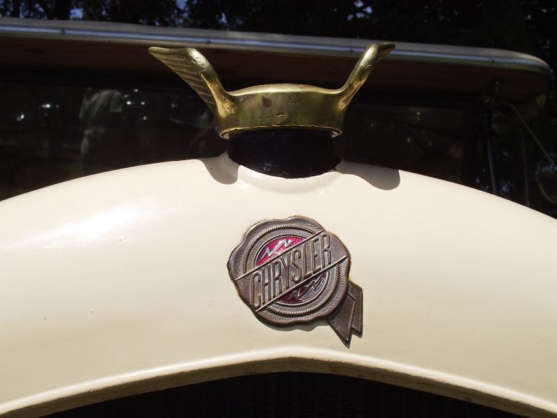
Source: Jalopnik
In the 1990s, Chrysler gave its logo wings and put the wax seal in the middle.
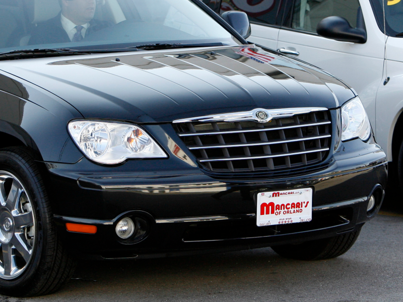
Chrysler introduced its current iteration in 2009, which keeps the wings but removes the center seal, according to Jalopnik.
Ford announced the discontinuation of the Mercury brand in 2010, according to The New York Times.
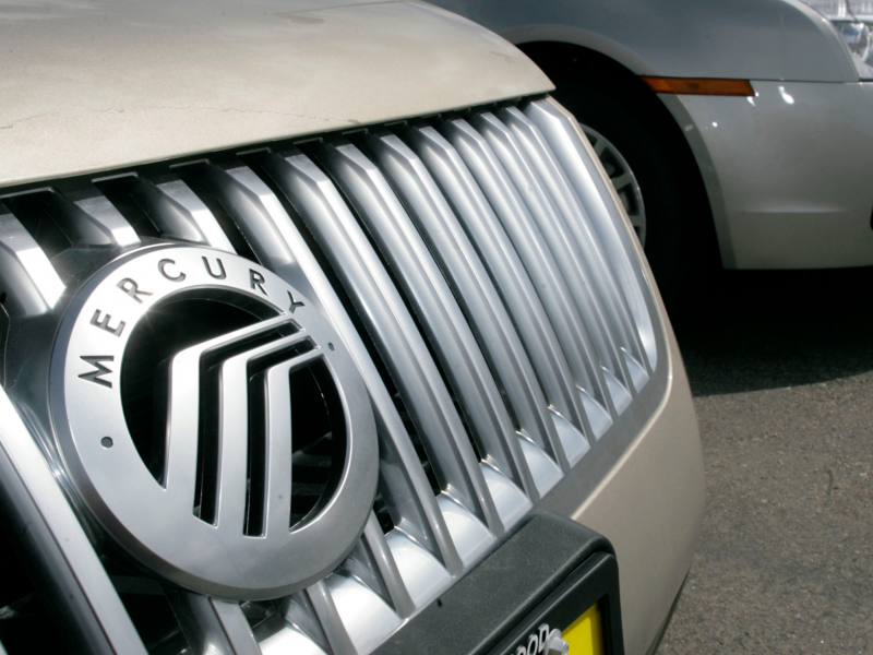
Source: The New York Times
"Oldsmobile production has remained unprofitable," General Motors said when they decided to end the production of Oldsmobile vehicles in 2004, according to CNN.
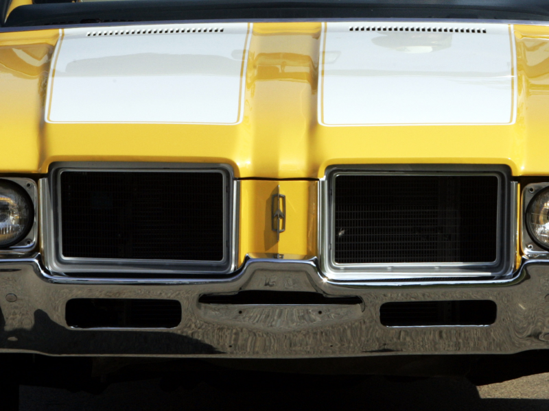
Source: CNN
General Motors announced its plans to discontinue Pontiac in 2009.
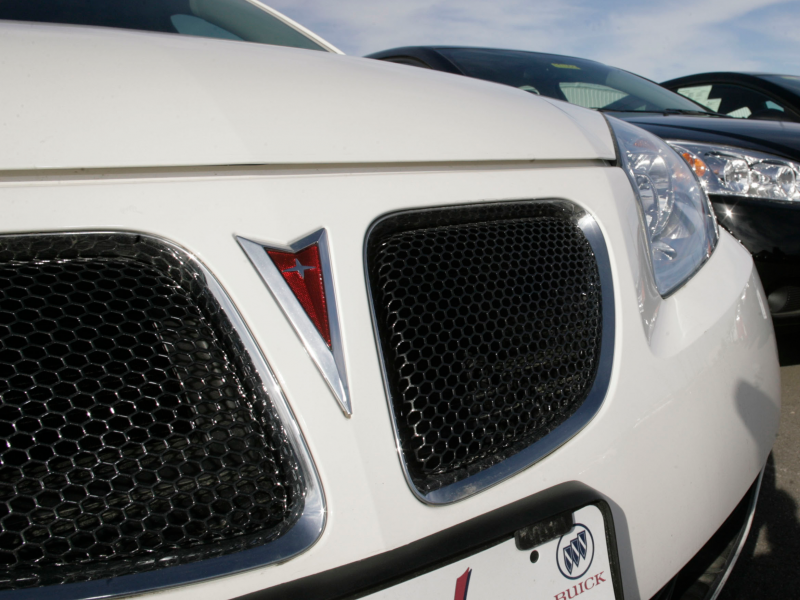
GM also announced the discontinuation of Saturn in 2009.
