Burger King
- Burger King introduced its first rebrand in 20 years in January.
- Two designers told Insider that the design successfully incorporates the brand’s original look.
- The new logo uses shapes and colors to suggest the look of a whopper.
- Visit the Business section of Insider for more stories.
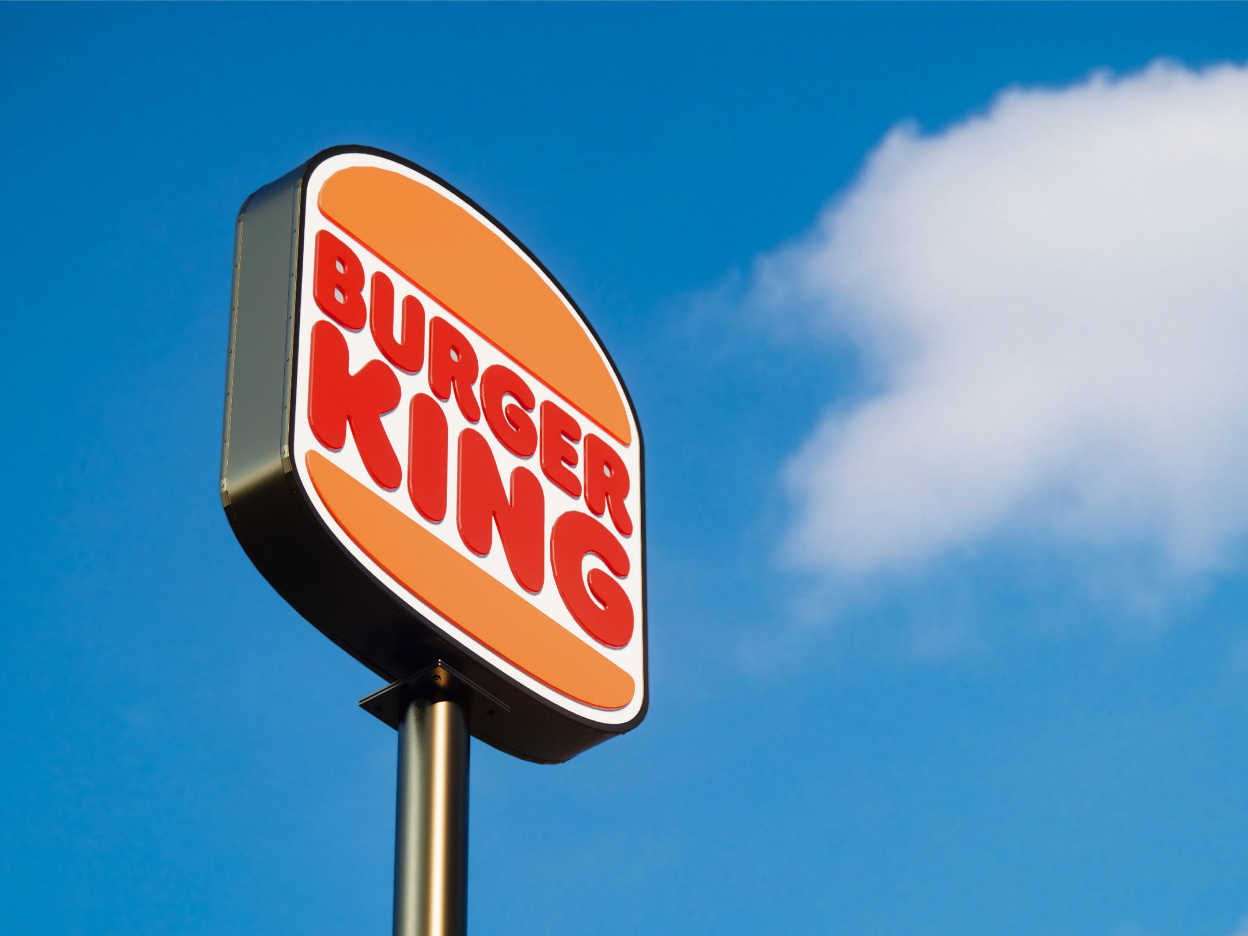
Burger King announced its first total rebrand in over 20 years in January, including a return to a logo with a classic look and an emphasis on the whopper.
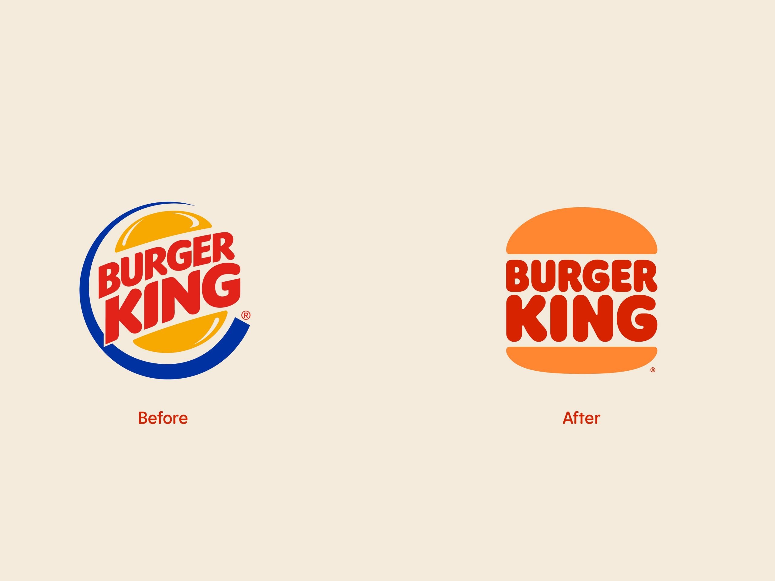
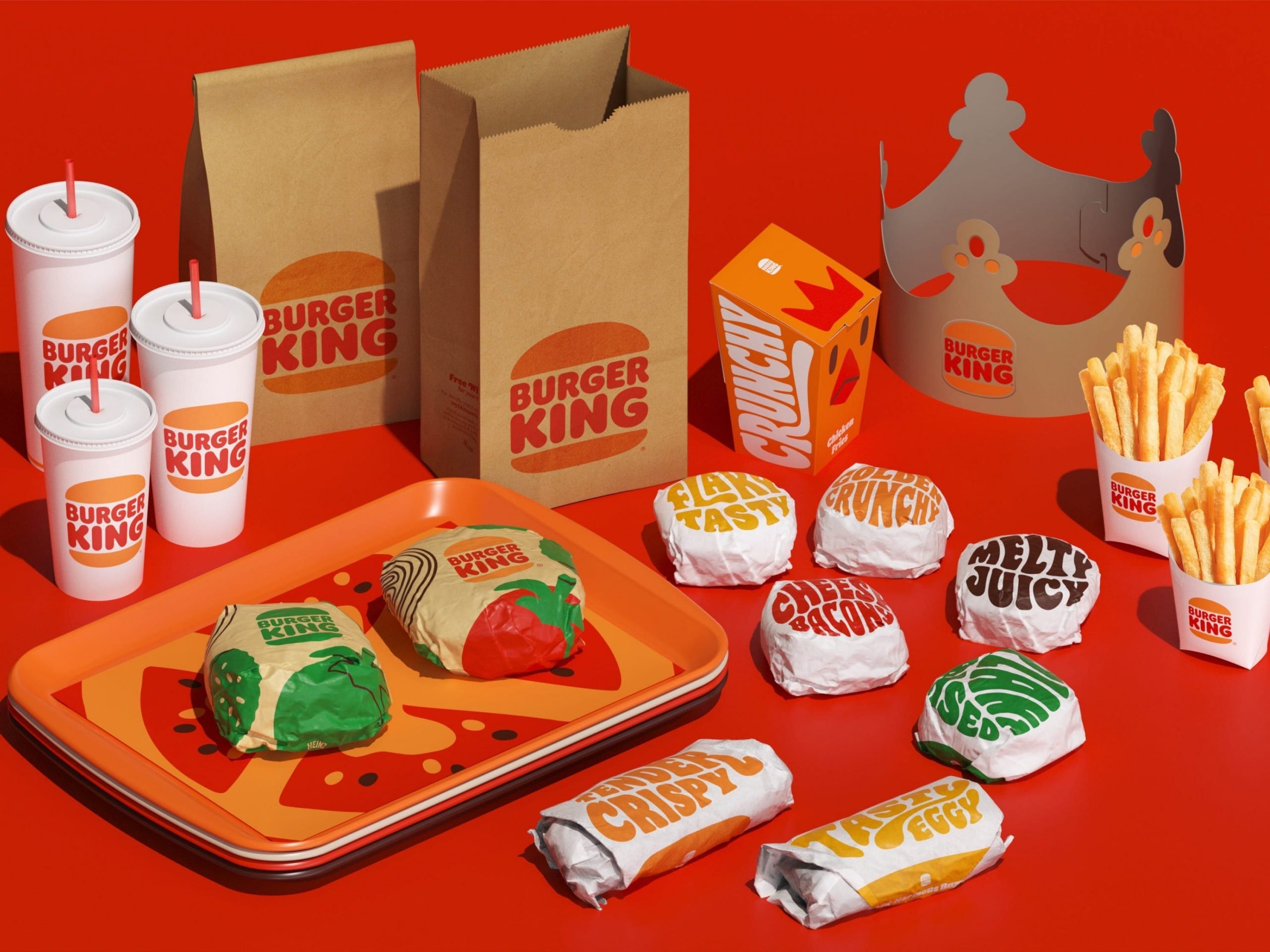
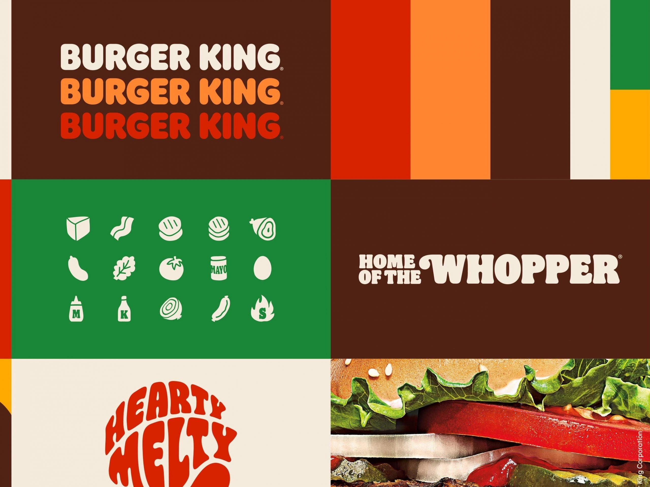
The new logo is a modern version of the classic BK look, putting the restaurant name between two buns. All the branding was redesigned in colors inspired by the whopper, too, including yellow, brown, red, and orange with a new “Flame” font.
The chain is slowly rolling out aspects of the design that take longer to change, like employee uniforms in new brand colors, and logos and signage that emphasize the flame-grilled whopper and open kitchens that show off the broiler.
So far, the rebrand has gotten positive attention from industry experts in Ad Age and consumers who appreciate the simple, pleasing look.
Insider asked two designers to share their thoughts.
Debbie Millman, cofounder of the Masters in Branding Program at the School of Visual Arts and host of the Design Matters podcast, was part of the team that designed the 1999 logo. She told insider she's huge fan of JKR Global's work with Burger King. The new branding has a "warm, retro vibe," she said and is reminiscent of the brand's roots.

Burger King
Around the time of the 1999 logo design, the Burger King brand was suffering. Sales were declining and the chain was trying gimmicks to bring in customers, from adding new menu items to briefly hosting an internet cafe in dining rooms.
"Swooshes and gradients were all the rage back then," Millman told Insider, and the former logo showed that Burger King was "modern and a bit sharper around the edges."
Steven Heller, who has written and edited more than 100 books on design and popular culture and cofounded the MFA Designer as Author program at the School of Visual Arts, was more critical of the former design. Heller called the design "kind of awful" because of "color combinations that don't work" and "that swirl or swoosh made it look more like a sports logo than a food emporium."
"Blue isn't a color that food companies use as a rule," Heller said. Burger King's chief marketing officer Fernando Machado agreed. "There's no blue food," he told Insider about the rebrand.

Burger King
"The redesigned logo reflects a new era for Burger King and its commitment to fresher, cleaner ingredients is best represented by looking back to simpler, less processed times," Millman said about the rebrand.
Heller felt similarly, noting that the new design nods back to the original concept. The new logo is "suggestive of real meat," and "much more tasteful and tasty than that more corporatized old logo."
Millman, who was around for the last redesign, told Insider that the culture and what kind of branding people like is different now than it was 20 years ago.
"I think people are craving less manufactured shine in the construction of logos and experiences, and prefer more straightforward honest identities now," she said.

Burger King
"A good logo is a refined logo. Refinement is everything. If the concept isn't rendered well, if nuances aren't there, it won't work" Heller told Insider.
Do you have a story to share about a retail or restaurant chain? Email this reporter at [email protected].
