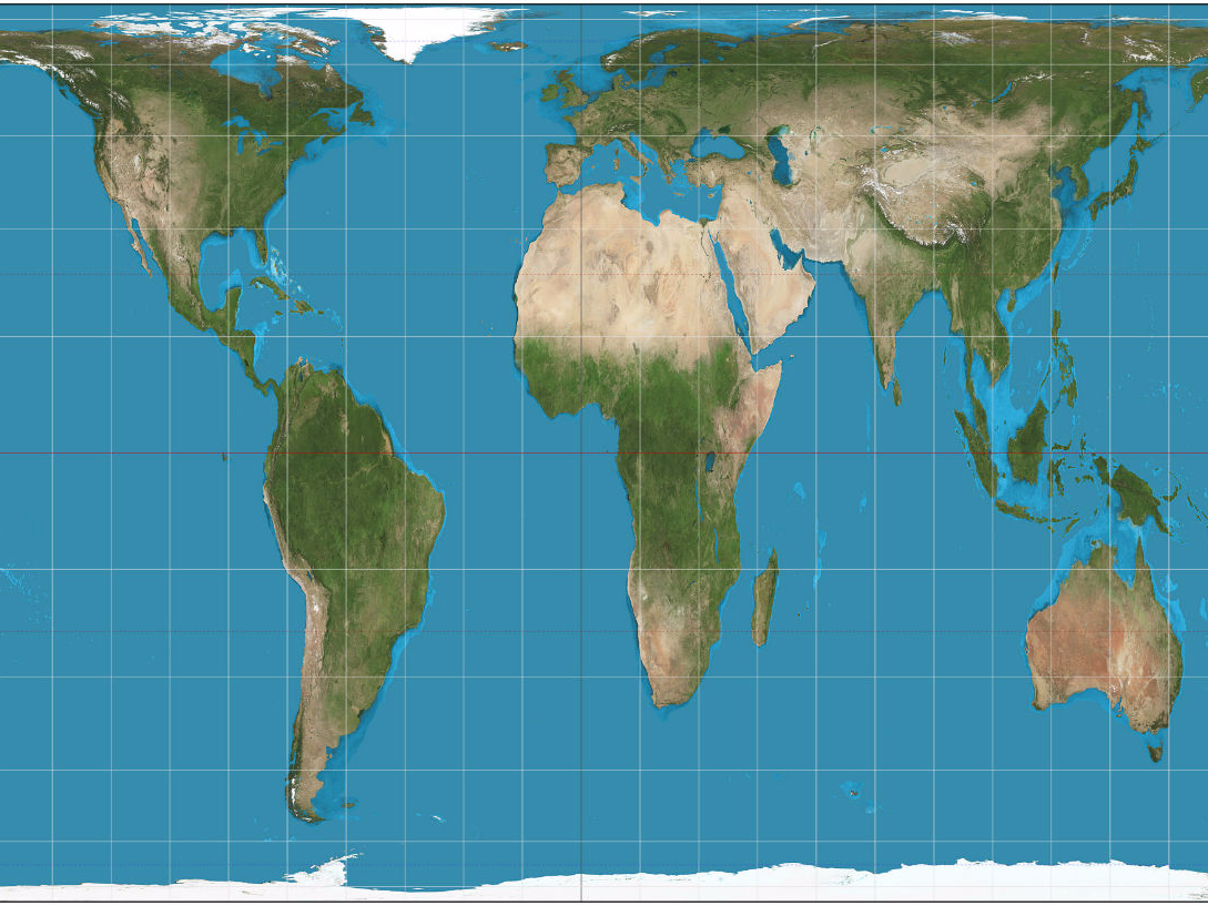
This week, children at schools in Boston would have found an unfamiliar map of the world in their classrooms, according to The Guardian.
City authorities decided it would be best to introduce the Gall-Peters style map of Earth to schools, because it shows the size of countries more accurately. It replaces the traditional Mercator map style that many of us are familiar with.
The Mercator was designed in 1569 by cartographer Gerardus Mercator. You probably saw it hanging in your Geography classroom, and it may be how you imagine the Earth to look.
However, it has been heavily criticised because it exaggerates the size of imperialist powers like Europe and North America, and shrinks South America and Africa.
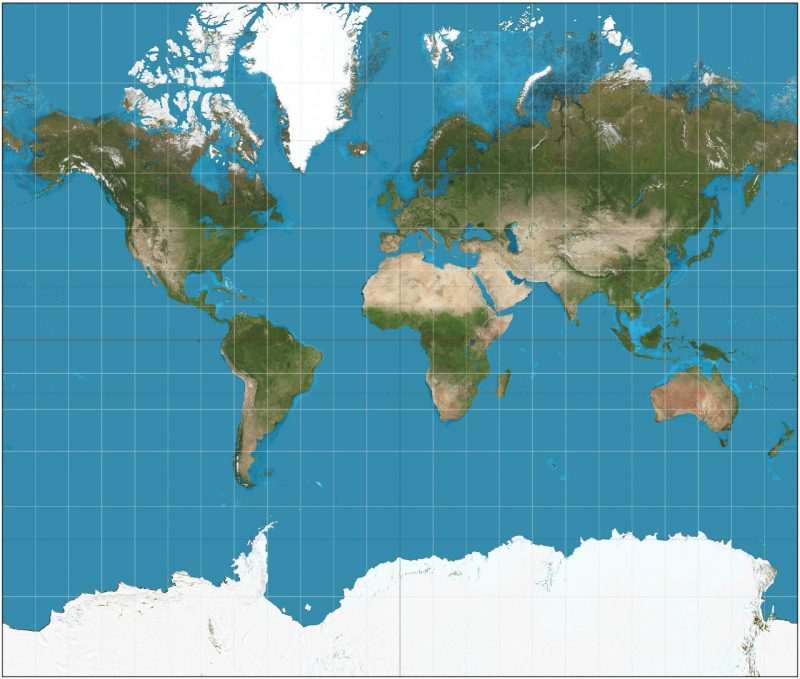
The Boston authorities thought in an era of "alternative facts," a shift in the map style was called for, to "decolonize the curriculum" in public schools, and more accurately depict the sizes of countries. Greenland, for example, is actually a lot smaller than the Mercator shows, and South America is really twice the size of Europe.
However, while some see the change as a victory against "fake news," not everyone is thrilled with the decision. The Gall-Peters map shows the correct sizes of countries, but it also distorts them. Countries are stretched horizontally near the poles and vertically near the Equator, so although the size may be right, the shape definitely isn't.
The problem is, it's impossible to stretch the 3D sphere shape of the Earth onto a 2D sheet of paper. No matter which way it's done, there will always be a compromise somewhere on shape, size, direction, distance or scale.
If the widespread use of the Mercator was a sign of bias, finding an alternative is a good idea. But the choice of Gall-Peters has upset map enthusiasts, who argue there are many other map types to choose from which aren't so ugly.
https://twitter.com/kennethfield/status/843666251566071809
Here are four alternatives to the Mercator and Gall-Peters maps:
The Winkel tripel projection (Winkel III)
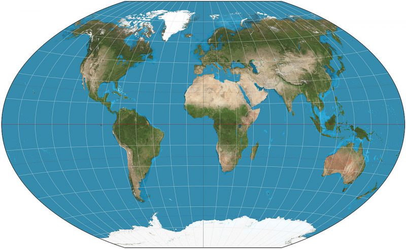
National Geographic adopted the Winkel tripel map in 1998, and it was designed in 1921 by Oswald Winkel with the intention of minimising three area, direction, and distance distortion.
The Kavrayskiy VII projection
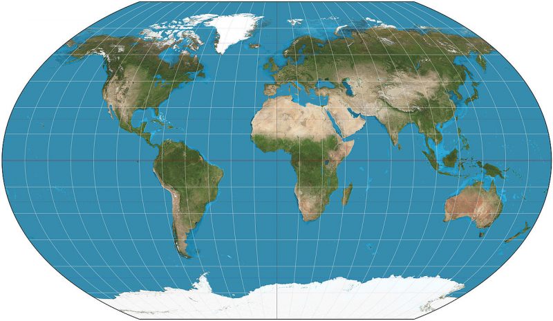
The Kavrayskiy map was designed by Vladimir V. Kavrayskiy in 1939, and scores well as a projection with little distortion. However, it isn't used much outside the former Soviet Union.
The Hobo-Dyer projection
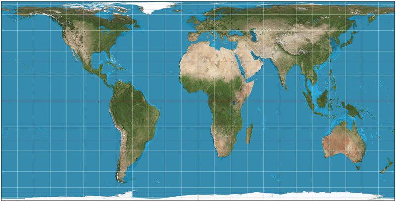
There is no north-south or east-west distortion on the Hobo-Dyer map. It's often used as an alternative to the Gall-Peters projection because it's more visually satisfying. The map stretches the low latitudes less than Gall-Peters, but the poles are more distorted as a result.
The Waterman
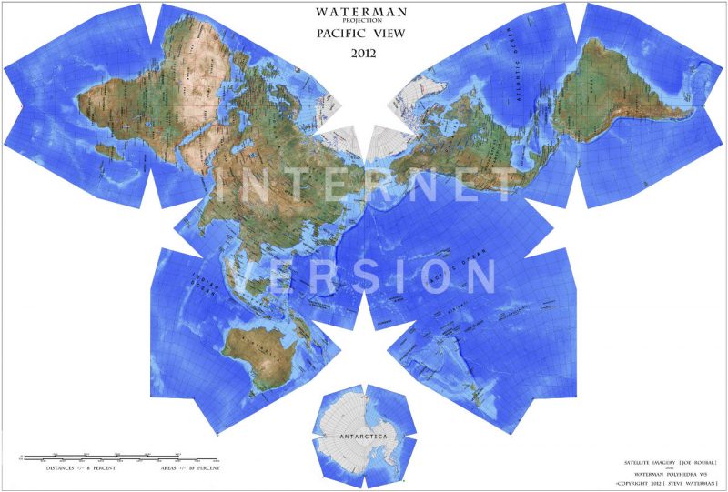
The Waterman - or "Butterfly" - world map was designed by Steve Waterman in 1996. It shows how the Earth would look if it were unfolded from a truncated octahedron. It was based on the Cahill projection designed in 1909 by cartographer and architect Bernard J. S. Cahill.
There are many other versions of the map of Earth, and they all have their advantages and drawbacks. But there's one thing almost everyone seems to agree on - you can't beat a globe.
https://twitter.com/jacobrichardson/status/843841734568304640

